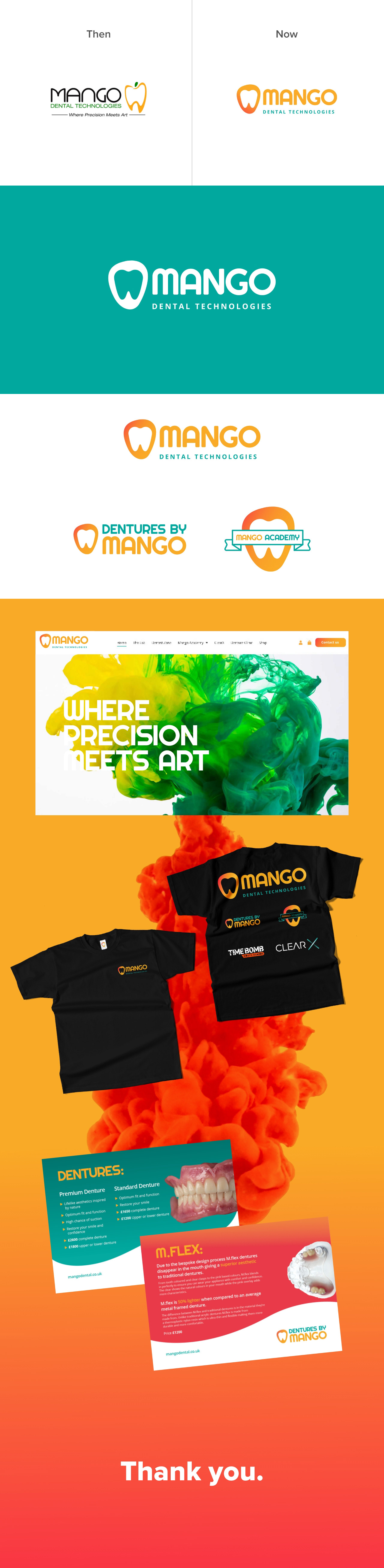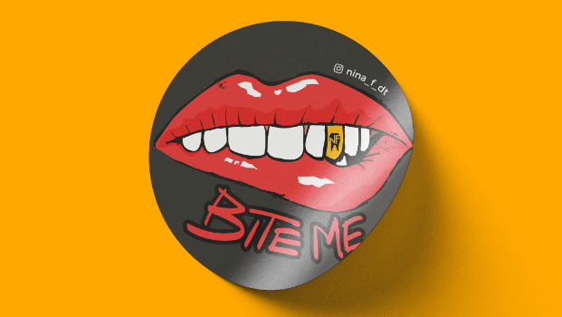
I was tasked with a rebranding project for Mango Dental Technologies, focusing on their identity. Keeping in line with their current brand styles, including colours and fonts, my objective was to redesign the logo and explore how it could be applied across various sub-logos within the brand architecture. I aimed to incorporate the shapes of a mango and a tooth into an emblem, while ensuring alignment with the existing brand elements.